The Horse & The House: the Market is Betting on a Slowing Horse to Run a Perfect Race
The market seems to still be pricing in perfection while willfully ignoring risks.
The combination of inflation falling MoM in July and the Fed shifting its course from one with clearly defined hiking schedules to one that's "data dependent" proved to be a potent dopamine hit for the markets. Jay Powell even slipped in a wildly bold comment, publicly declaring that they had arrived at a neutral rate. The S&P ripped 17%, regaining roughly $6 trillion of lost wealth in two months.
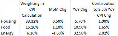
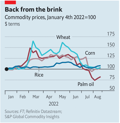
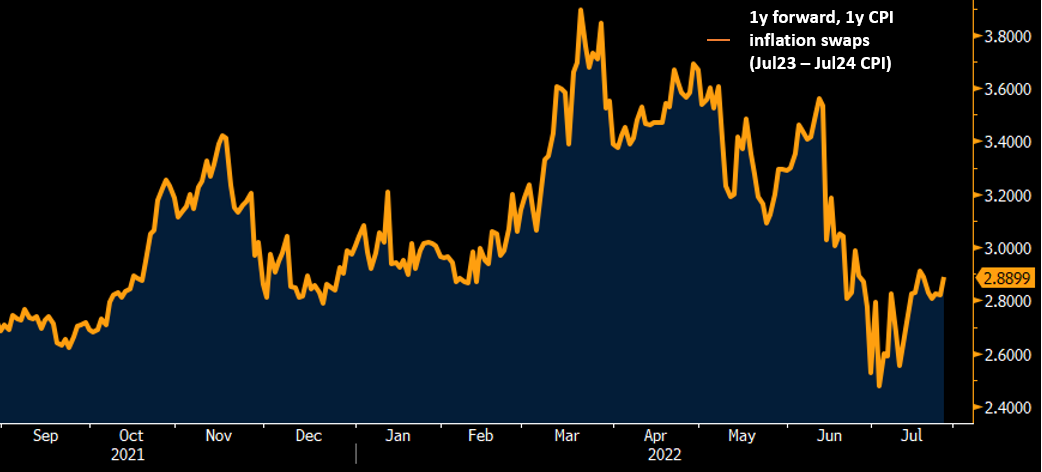
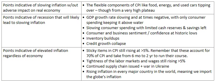
Beyond the headlines, the market saw encouraging pieces of more granular evidence on its two most pressing fears: inflation and recession. The three largest contributors to inflation – housing, food, and energy — can be seen in the table below. Noticeably, the MoM fall in energy prices explains the slowing of the overall CPI number. Since then, we've seen continued progress on another big-ticket item: food prices. Chart 1 shows food commodity futures in Chicago for delivery in December. Most are verging on the pre-war level and palm oil has even sunk well below it. Note that this portrays futures prices, not what is being paid by customers today. The latter remains elevated, still climbing at the ~12% annualized rate it has maintained throughout the year so far. However, the futures market should calm fears of mass shortages and drive expectations that these present-day price gains will alleviate in the coming months. Finally, the housing market exhibits signs of rolling over as well. Prices are down significantly across multiple measures (1,2,3) and homebuyers have eased their buying while homebuilders have slowed their building. All this has led both consumers' and Wall Street's to believe that inflation has peaked and will decline to a ~3% level within a few years time. [side note: interestingly, consumers expect inflation to be tougher to shake over the short-term than the Street does. The former expects inflation to be 5.3% next year before easing to nearer the Fed's target in three years' time whereas the latter has it priced to collapse dramatically to 2.8% next year as seen in Chart 2.]
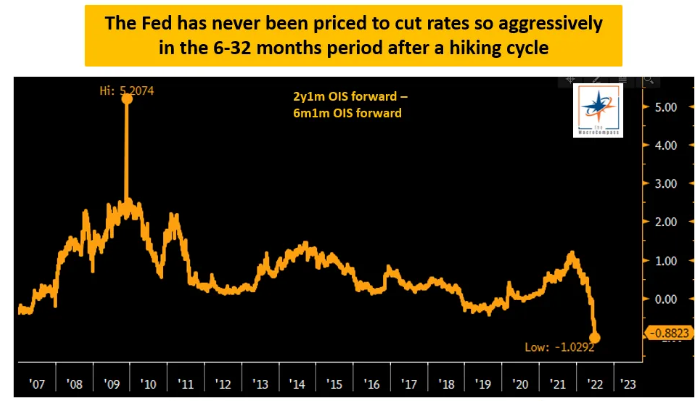
Meanwhile, at first glance, the economy appears to continue chugging along okay. The reports of major commercial banks confirm that consumer spending remains robust while household debt servicing cost remain at historic lows. Corporate earnings have continued on at a healthy pace, with ~3/4ths of firms in the S&P that have reported Q2 earnings beating estimates (a fairly standard rate). Indeed, Wall Street expects those earnings to keep marching on at an ~8% annual growth rate through 2023. Finally, financial conditions have abated their contraction while the bond market has a strong opinion that the Fed will cut rates by ~100bps next year as seen in Chart 3.
So, what's my problem? As mentioned at the outset, it's that even including a 14% decline from its peak, the market remains priced to perfection. As Bridgewater articulates:
Markets are discounting one sharp round of tightening—comprised of a rise in short-term interest rates to just above 3%, combined with more than $400 billion of contraction of the Fed’s balance sheet—and that this will be enough to bring inflation down to 2.5% with stable growth and no dent in earnings. From there, markets are discounting that the achievement of these goals would allow a subsequent 1% drop in rates from their peak.
To reiterate what the markets are currently pricing in: a) inflation collapsing t0 under 3% in a year b) without impacting unemployment, corporate earnings or other aspects of the real economy, and c) the Fed letting the flood gates open again at the beginning of next year.
Like gambling at a horse racing track, you must understand how fast the horse runs and the odds that the house is giving you. Personally, I am skeptical of both.
The Horse
I have a range of problems with the market's assumption that inflation will flutter harmlessly down like a feather.
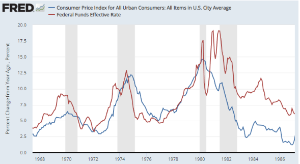
First, if inflation is indeed rolling over, it's doing so from historically high levels. This point is rather trivial, but I think isn't fully psychologically baked in. Whether or not CPI has peaked, it's still at 8.5%. Over the last 110 years, the only times America has seen 8.5% inflation has been during WWI, WWII, and the 70s/80s. Don't let Jerome tossing around 'neutral rate' lure you into believing that getting from 8.5% to 2% will be a walk in the park.
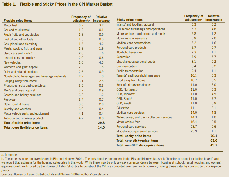
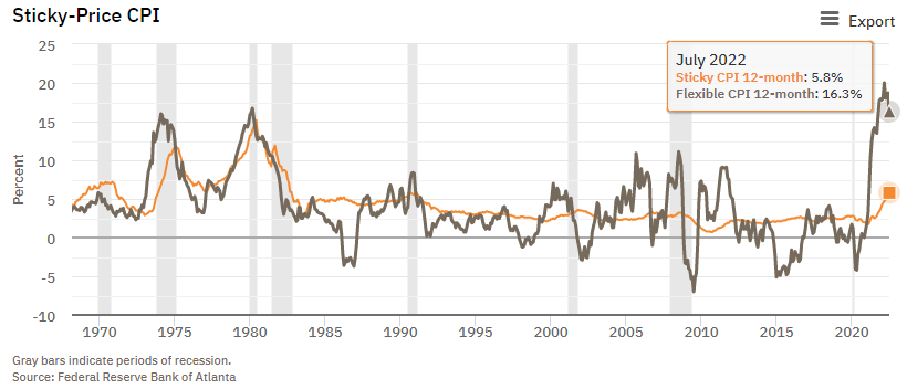
Second, the fall in CPI was caused by the highly cyclical and price-flexible components rolling over. The sticky, non-elastic components are still rising. The difference between flexible and sticky price goods refers to how often their prices are changed. Flexible ones are changed at least every 4.3 months (a relatively arbitrary cut off used as convention from this study), while sticky ones are updated at durations over that threshold. The former are things like food, energy, cars & trucks, with some components like fuel changing every 3 weeks. Sticky components tend to be service-sector items like housing, education, and medical care. Some of these items like housing are measured in years. Sticky-price goods account for 70% of the CPI figure and their rise hasn't slowed down at all.
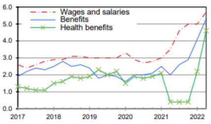
Another stubborn cost that continues rising steadily is wages, growing 5.7% YoY. Just about any econ 101 class will cover "sticky wage theory," which observes that wages are slow to move up and even slower to move down. As much as people like getting a pay bump, they hate getting a pay cut even more – Dan Kahneman's Prospect Theory would predict that they'd hate a pay cut roughly two times as much as they'd like a pay raise of an exactly equal amount of money. As such, employment contracts often embed a very slight annual pay raise that's just barely enough to cover rises in living costs. That low growth rate means the company should be able to surprise the employee to the upside in the form of a year-end bonus as long as the company's economics are reasonably normal; only a catastrophic year would force the company into renegotiating their contracts to give their employees an explicit demotion. In the latter scenario, companies actually often fire employees before giving them explicit wage cuts.
Sticky wages became a massive problem in the '70s & '80s. A wage-price spiral ensued where inflation expectations become engrained, leading people to demand raises to keep up with the cost of living which causes more inflation and so on. A significant difference between then and now is that the labor union participation rate has fallen from 20% in 1983 to 10% today. Labor has a correspondingly lower bargaining power today, so a wage-price spiral is of somewhat less concern today especially with inflation expectations already shrinking rapidly. With that said, if the Fed doesn't permanently crush inflation as it failed to do in the 70s, inflation expectations may become unanchored again which would engender a wage-price spiral of some severity.
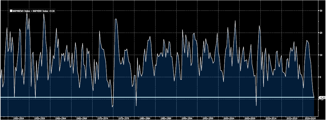
Let's move beyond the theoretical stickiness of wages and dig into the specifics of why wages are so buoyant right now: there's a lot more demand than supply. As seen in Chart 6, in the last 20 years there hasn't been a time evenly remotely resembling the present demand-supply picture. There's currently almost 2x as many employers looking to hire someone as there are unemployed people looking for a job. As with anything else, that pushes the price of the incremental hire upwards and causes wage inflation. Indeed, the number of unemployed per job opening is the most predictive metric of forward median CPI (1,2).
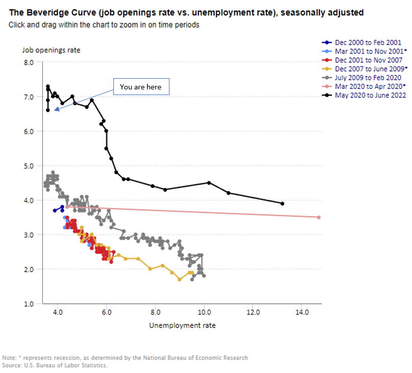
One complication with the above picture is that the Beveridge curve lacks the subtlety necessary to capture the entirety of the economic reality it intends to – the number of job candidates for every job opening. The unemployment rate is a convenient shorthand for that but excludes those leaving one job for another without ever becoming officially unemployed. Just because they didn't show up in the unemployment statistics doesn't mean they weren't candidates for that new job. Chart 7 seeks to take that into account, by adjusting the vacancies / unemployed by the actual job-to-job transitions relative to the stock of employed workers.
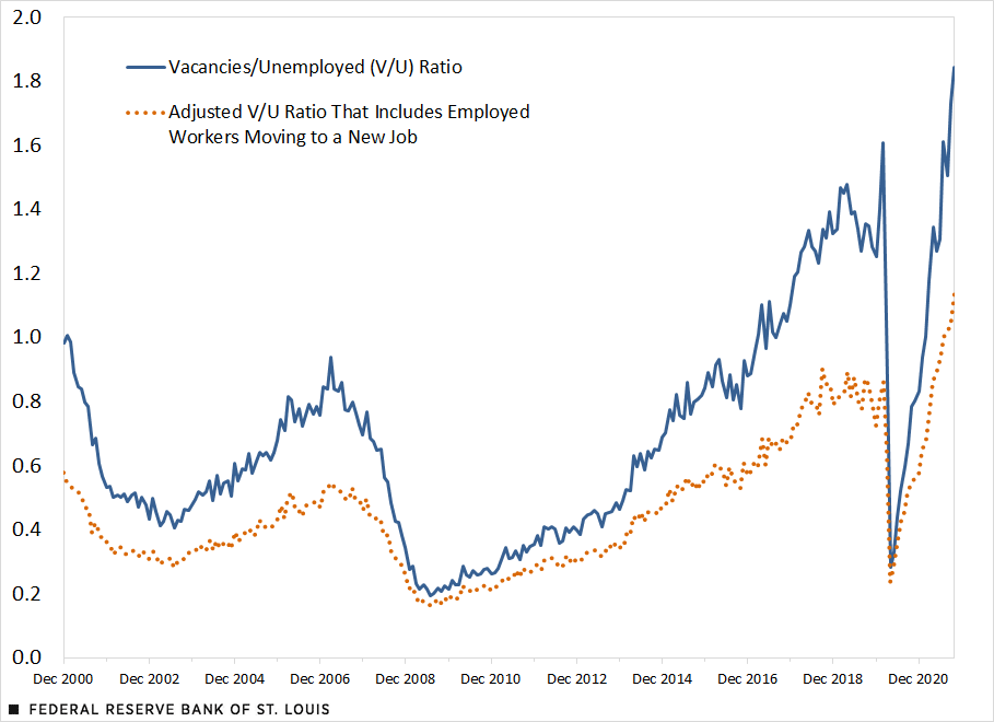
However, note that these are job transitions, not net new candidates. If an employed person leaves the current firm they're at for a vacant position at another one, then their former firm either seeks to replace them by opening up the recruiting process in which case there'd be no change to the total number of candidates relative to job openings or nixes the position entirely. The latter scenario underscores the fundamental tradeoff we face between inflation and economic growth – a theme throughout this piece. While having fewer net jobs available may ease some inflationary pressure, job destruction shouldn't be cheered for.
The adjustment to the Beveridge curve indicates that the curve on its own likely overstates both the wage-related inflation and economic growth pressures. And, even with the adjustment, the labor market remains historically tight. Unless either the demand for workers plummets or a wave of net new people enter the workforce, the structural forces supporting wage inflation will remain.
Despite the evidence above, Fed officials are confident they can alleviate labor market tightness without causing unemployment to tick up (see here for some quotes). The tricky thing is that destroying demand for workers intuitively entails destroying demand, period. In other words, you'd guess that a world in which companies freeze hiring en masse typically coincides with one in which the economy at large also seizes. Indeed, since the 1950s, every time the job openings rate came down from a quarterly peak, unemployment shot up simultaneously. On average, the unemployment rate rose by 2.1% in the two year following such a peak.
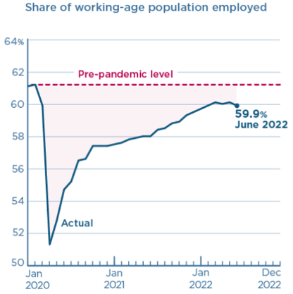
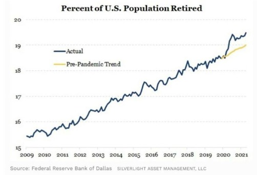
I'm also skeptical of the claims by Fed officials that this time will be different because the Fed has no control over the main ways in which the labor market could cool off without adverse effects. The first pathway would be a strong improvement in matching efficiency – i.e. removing excess friction between those seeking a job and those providing one. The problem with this is the rate hasn't improved in decades and cannot be controlled directly. The second way would be via a massive reversal of the Great Resignation in which now retired people re-enter the workforce in a wave. This provides some hope, though, there has yet to be any evidence of this occurring. Instead, the labor participation rate has stalled below pandemic levels and even declined this last month. It may well be that the pandemic and the temporary explosion in all asset values that came with it enticed boomers to retire a couple years earlier than otherwise planned. A five percent wage bump might not be enough to bring these types back from the beach house.
The icing on the cake is that even if labor markets do loosen, it has historically taken roughly two years for that to flow through into a decline in wages. Though that figure has a wide range, it suggests that even in the best case scenario where labor markets ease without a rise in unemployment, there's still a limited probability that wage-related inflation would come down over night.
The above analysis explains my skepticism with the market's belief that inflation will come down quickly without a corresponding collapse in demand. So, what about the real economy? How does the demand look?
Well, it's complicated. There's a reason why the saying "economists / xyz hedge fund manager / the stock market has predicted 10 of the last 7 recessions" is cliché. That sh*t ain't easy.
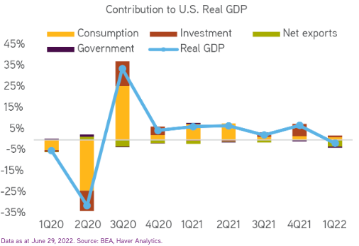
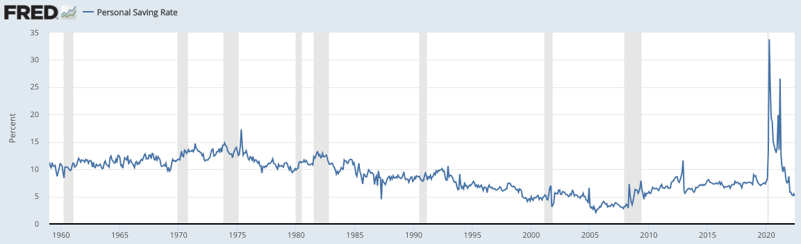
One thing is clear: so far, the award for best economic participant goes to... the American consumer. With $2.8T more in savings than they had going into COVID and a year's worth of pent up Walmart-storming, Disneyland-going energy, one shouldn't be shocked that they've been the largest contributor to GDP since exiting the depths of the pandemic. In fact, one shouldn't be shocked by consumption driving the economy period, since consumption has contributed 60-70% of GDP since the '50s. What's alarming this time around is that it has often times accounted for more than 100% of GDP. I.e. it's single-handedly keeping GDP positive.
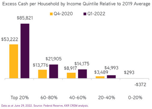
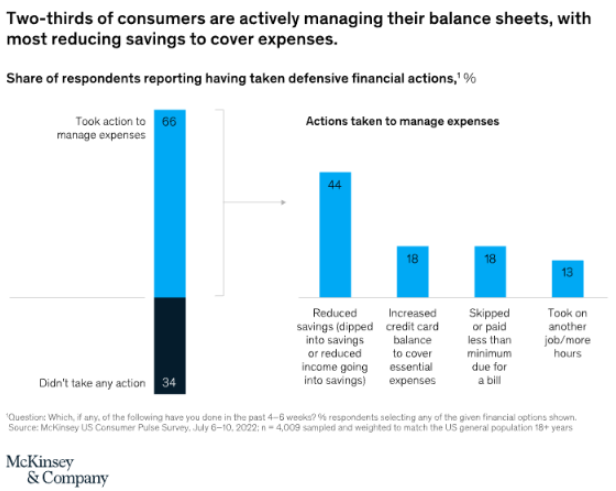
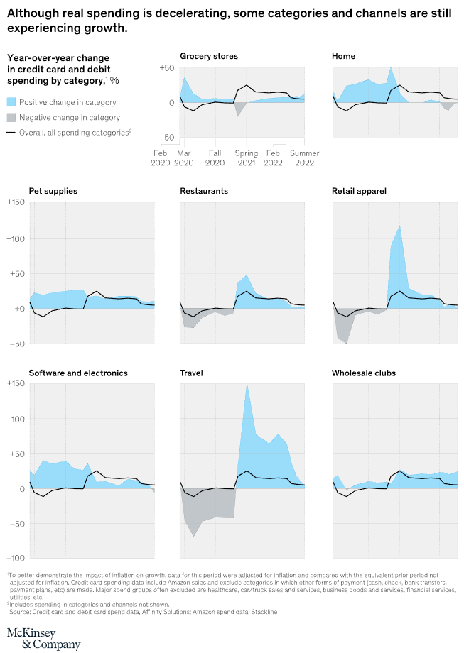
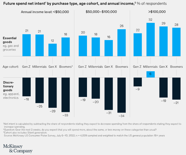
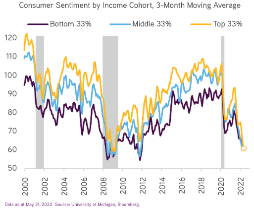
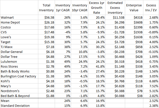
The question one must ask is: can this continue at a strong enough rate to hold up the economy? Based on the following charts, my guess is most likely not. Charts 9-11 seek to understand the state of the consumer's balance sheet. The answer is that those $2.8T in excess savings have been spent – and then some. Households have eaten into their savings across the board, with the lowest income groups having completely depleted their cash reserves. Some have even taken on more personal debt or a second job to cover expenses, while a small portion have begun flowing into delinquency. Charts 12-14 look at current spending patterns, intended future spending, and consumer confidence levels. As one might guess based on the consumers' balance sheet, they plan to cut spending on basically everything except the essentials. These spending cuts can be corroborated by bloating inventories across nearly every public retailer as seen in Chart 15 as well as across manufacturing firms as seen in Chart 16.
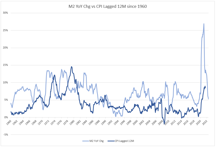
All of this reflects the primary piece of good news about inflation: people are spending less and less of their money – in large part because they don't have much more to spend. After all, inflation occurred in the first place mainly because Congress handed out a total of $2.8T to every man, woman, and child, living or dead. Unlike the Fed's efforts to 'print money' which cannot reach the general public directly and can only sway investor psychology, when Congress turns up the dials via deficit spending that is true, ex-nihilo money that goes straight into the real economy. And, in this case, they hand delivered checks to households' mailboxes, injecting those fresh greenbacks via syringe right into the economy's bloodstream. Yet, those new dollars ended up sitting in bank savings and deposits accounts for a while due to the once-in-a-generation fear and uncertainty of early 2020 combining with the fact that lock downs made it effectively impossible to spend money even if people weren't terrified meant. So, for the time being, the government's new supply of money was met with a widespread desire to hoard it – i.e. the demand for money. But, by early 2021, the rollout of vaccines along with rising confidence and a hunger to get out of the basement meant that those savings were unleashed, and on scales measured with 12 zeros. People no longer demanded cash, they demanded goods and services. That is why inflation exploded one year after the unprecedented rise in M2.
So, where are we now?
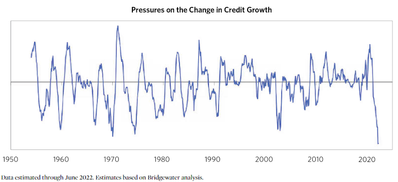
This collapse of the most spendable forms of money as measured by M2 (which is the sum of currency + checking accounts + savings accounts + retail money market funds) is echoed by the collapse of the next most spendable money: credit. The following three charts show the proprietary credit growth models of three high-quality macro specialists.
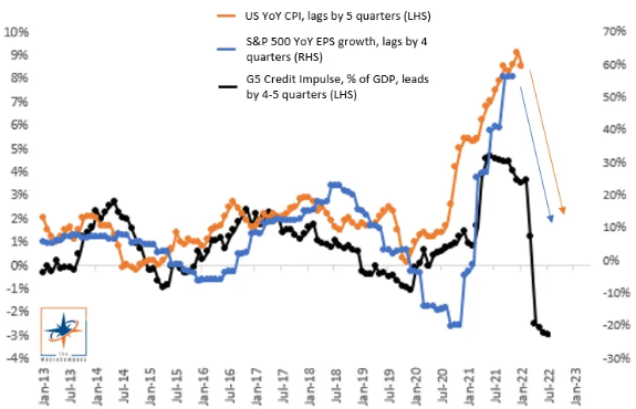
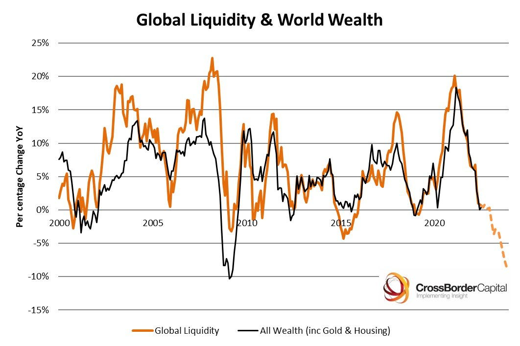
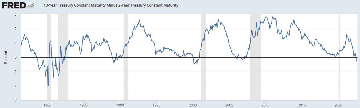
Beyond M2, what else might explain this massive contraction in credit growth and liquidity? For one, the yield curve is inverted. This acts not just as a recession indicator for speculators and investors, but it also has a mechanical impact on credit growth and the real economy. Every financial investment in the world betting on better economic outcomes in the future are akin to shorting the 2yrs to go long the 10yrs: they're duration plays. Whether you're buying a house, the S&P 500, lending money to an entrepreneur or investing in building a new production factory, you're selling a short-term asset (i.e. dollars with a duration of zero) in exchange for a longer-term one (a deed, share of stock, loan and a plant, respectively). When the 10yr-2yr spread turns negative, all those bets instantly become uneconomical – they become "negative carry" trades. In other words, investing in a positive future becomes a negative sum game. Keeping that spread negative grinds the economy to a halt. That is why the 10yr-2yr spread has yet to fail to predict, or more accurately bring on, a recession.
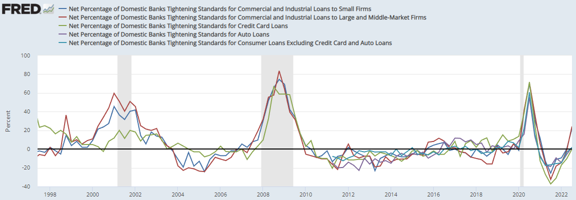
A concrete example of this can be seen with the grease that makes our economy go round: bank credit. Banks' entire business model is based precisely on the profitability of this concept: they borrow short to lend long, capturing the spread embedded in the time value of money. When short rates rise above longer ones, that business becomes unprofitable fast and they stop lending. Hence, today you see banks tightening their lending standards across all forms of loans.
A final trend slowing credit growth is the prospect of QT. While it's been more talk than walk so far, it has clearly affected the liquidity of markets in more indirect ways.
Okay, we've covered a lot of ground. Let's start to pick up the pieces and figure out how the puzzle fits together.
So, while I'm comfortable with the statement that inflation has peaked barring more external shocks, the assumption that it will be at 2.7% within a year with 5% real corporate earnings growth and no recession is absurd to me. Indeed, I can't help but agree with Bridgewater's forward estimates of growth and inflation (at least roughly for the US, I haven't analyzed other markets):

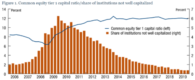
For the sake of argument, let's assume the slow down in spending, credit growth, and economic activity outlined above comes to fruition. The follow-up question is how much will firms suffer from the tide going out? This mustn't terrify anyone. We're not headed for 2008. The banks and other systemically important institutions are neither running wild with risk nor highly levered (see Chart 26). On the contrary, they've been battening down the hatches and preparing for a storm for a while.
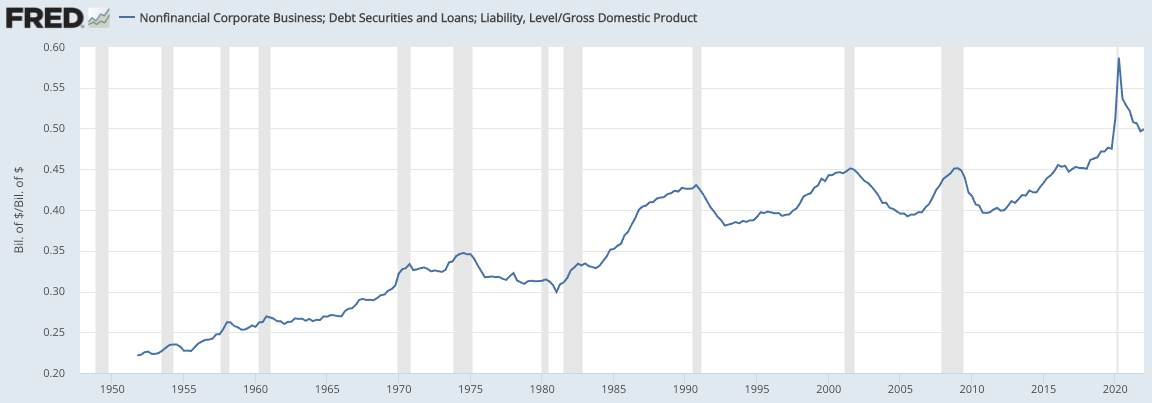
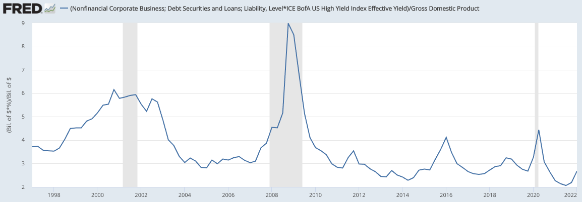
Moreover, while corporate debt is exceptionally high, debt servicing costs as proxied by total corporate debt * HY yield are exceptionally low. As long as spreads don't gap upwards, there shouldn't be serious problems. That explains why the market pricing of default risk remains relatively low and financial conditions remain stable.
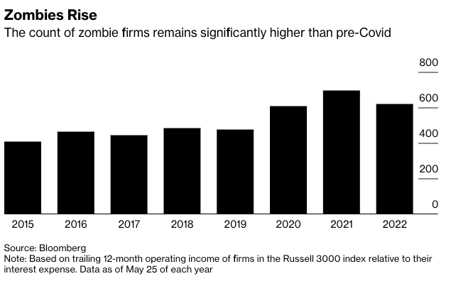
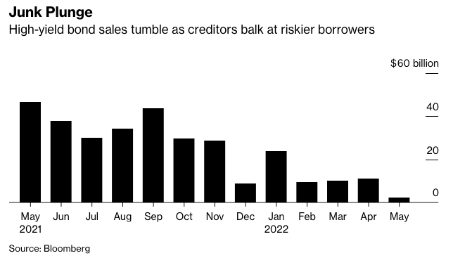
The only concerning factor I see is the mounting army of zombie firms, or those that cannot pay their interest expenses with their operating income. To keep stumbling forward, these firms require manageable interest costs and, most importantly, open capital markets to continually refinancing their debt. So far this year, high yield bond issuance has plummeted to the lowest level since 2002. Whether or not that's a great proxy for those firms' ability to roll over their debt is unclear, but it doesn't exactly inspire confidence, especially when zombie firms represent nearly 20% of the Russell 3,000. How many of these firms go under depends on the degree to which liquidity becomes a scarcity.
Taken these points together, I'd expect a reasonably standard default cycle if a full-blown recession does occur.
Finally, about Mr. Market's last assumption, that Mr. Powell will ease rates by 100bps early next year? That I cannot accurately guess because it requires forecasting the thought process of another person, specifically the policy choices of someone who has been detached from reality for over a year.
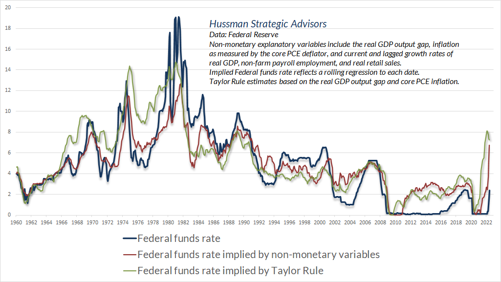
With that said, I can say a few things before leaving the rest up to chance. First, any normal measure of the looseness or tightness of monetary policy screams that it remains very much accommodating. The real Federal Funds Rate (FFR) is at -6%. The Fed Funds Rate minus Core Sticky CPI is -3%. The Taylor Rule & another approximation can be seen below. Across all of these approximations, no moment in the last 60 years has seen monetary policy this loose (except last year). Do not buy into Jerome's lie that monetary policy is currently neutral (yes, I feel okay using the word 'lie' given the last time he used the word 'neutral' was in 2018 when inflation was 2%. This ain't the same rodeo, Jerome. Whether you wanna call it negligence on a global scale or a white lie is personal preference).
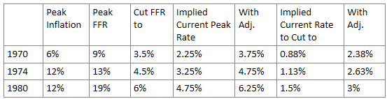
The precise looseness of current policy is unknowable. The metrics above likely overstate it because they don't take into consideration debt levels and because it appears that we're entering a recession irrespective of monetary policy. In the 1970s it ultimately took a 20% FFR to quell inflation. But, back then debt was ~6x GDP, and the real GDP growth rate averaged around 4%. Today, the economy is saddled with twice as much debt and is growing at half the rate. So, some back of the napkin math would tell you that it'd take 20%/4 = ~5% to have a comparable effect. Chart 23 acts as a sanity check that these relationships between FFR, debt, and growth are reasonable. It seems that our economy can't take much more than a 3-4% rate without something breaking – more specifically, without the Fed's wherewithal breaking.
Note that the only reason that Volcker had to take the FFR to 20% was his predecessor Arthur Burns took his foot off the peddle and loosened monetary policy significantly after the first time inflation peaked. That is exactly the action that the market is pricing in. Sound foreboding?
So, if our goal is to avoid the 1970s, where should the FFR be? The analysis below tries to estimate that using the very rough 'divide by 4' rule of thumb. Additionally, notice that every time the FFR peaked in the '70s & '80s, it was well above inflation – not 6% below it. For instance, the first time the Fed tried to stomp out inflation but failed in 197o, it raised the real FFR to +3% vs. the current -6%. To adjust for that difference, I moved the implied rates up by +1.5% (a conservative haircut to what the difference in eras would imply: (+3 – -6)/4 = +2.25). These estimates are of course highly unscientific in nature; they merely aim to find directions to the correct ballpark.
The short answer is that if we want to avoid the 1970s then we should certainly not do what the market is pricing in. A 3% terminal rate with a prompt 1% cut would leave us eerily vulnerable to at least another wave of inflation and another round of hikes, and so on. If I was Jerome, I'd park the FFR at 4% and have it sit there until all inflation metrics, especially the sticky ones and wages, were well beneath it. This would almost certainly take a couple years and entail a meaningful recession. Indeed, a recent study indicates that only the most optimistic assumptions about the future would bring inflation down to target levels without a significant bump in unemployment. Using more plausible assumptions, economist Jason Furman estimates that an unemployment rate of over 6% maintained for 2023 & 2024 will be required to bring inflation down to target. While that sounds horrible, I strongly believe it's the best of the bad options we've boxed ourselves into.
For better or worse, I'm not in Jerome's seat. And, considering he's been way behind the curve for over a year and has an illustrious career to tend to, the next 12 months may very well end up looking a lot more like what the markets have priced in. If that's the case, I'd become even more concerned about inflation & the economy in the aftermath of those 12 months than if we ripped the Band-Aid off once and for all.
The House
Ok, so we've now delved into how fast the horse you're betting on is running. What about the odds the house is giving you to bet on that horse?
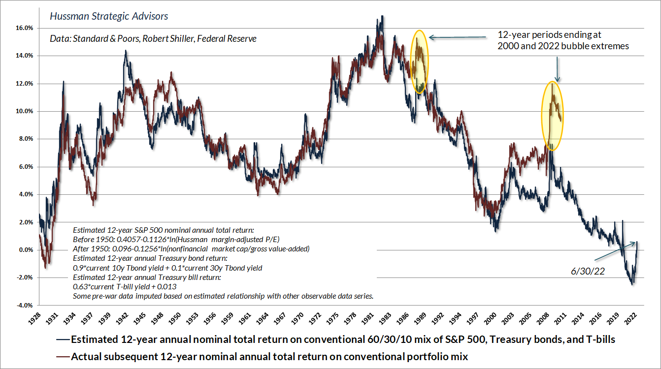
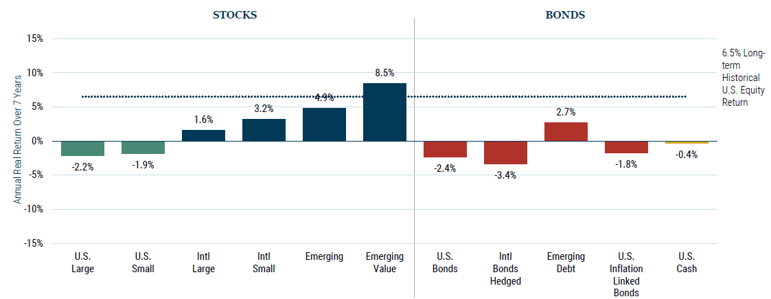
Don't worry, this section will be far shorter. Once you know what game you're playing and what the rules are, it's a lot easier to calculate the odds. In this case, the odds are how much you have to pay to get exposure to the factors described in the section above. To answer that, one must figure out the most reliable valuation measures and assess where they are right now. Chart 24 addresses the former and Chart 25 delivers some mixed news. The good news is that the market's valuation has come down quite a bit since the beginning of the year. The bad news is that it has come down to... 2001 levels. Chart 26 indicates that if the last 100 years of financial history are still relevant, then the S&P should barely break even over the next 12 years. GMO's forward 7-year asset class projections echo that estimate.
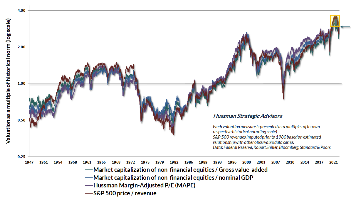
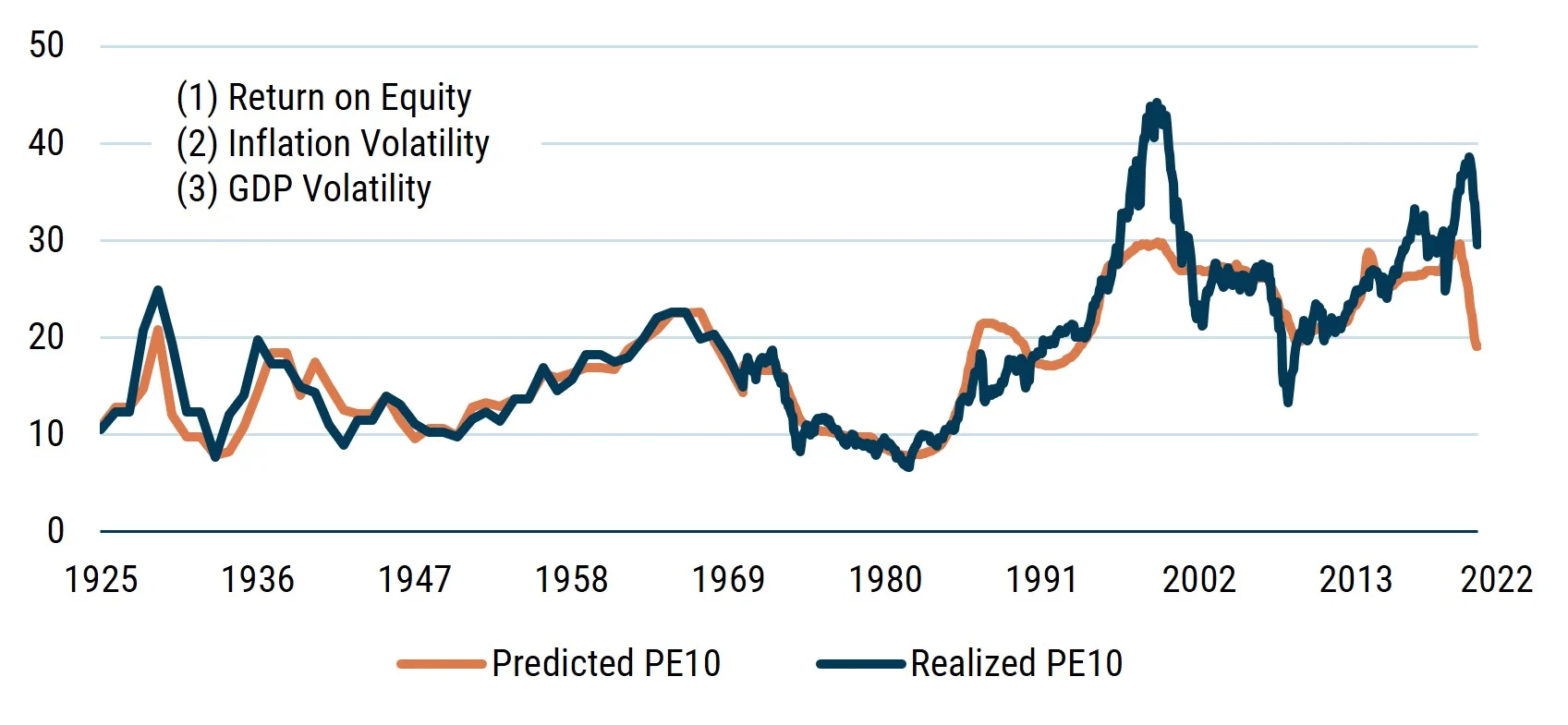
Why such bad forward estimated returns? It almost feels unfair. Unfortunately, the better question is: why hasn't the market imploded yet? Not only did the market reach a level of overvaluation that by some measures has never been seen in recorded US history, but it's also now behaving in a way that's highly unusual. Mr. Market loves three things: 1) high profits, 2) stable economic growth, and 3) inflation of around 2%. He'll pay handsome multiples when those the boxes are checked. Otherwise, forget about it. In fact, those three factors alone explain over 80% of the market's P/E over the last 100 years. GMO's Comfort Model maps this over time. It also includes the 10-year US bond rate and an on / off switch such that the P/E is a bit lower following a down quarter (human psychology ain't perfect). These two bring the correlation up to 90%.
Right now, we're just barely hanging on to those nice profits, but the latter two concerns flew out the window a while ago. The only time Mr. Market diverged this greatly from his comfy spot was in 2001. Assuming the last 100 years of history are still relevant, let's look at the last linchpin holding this whole thing up: corporate profits.
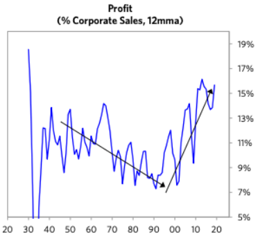
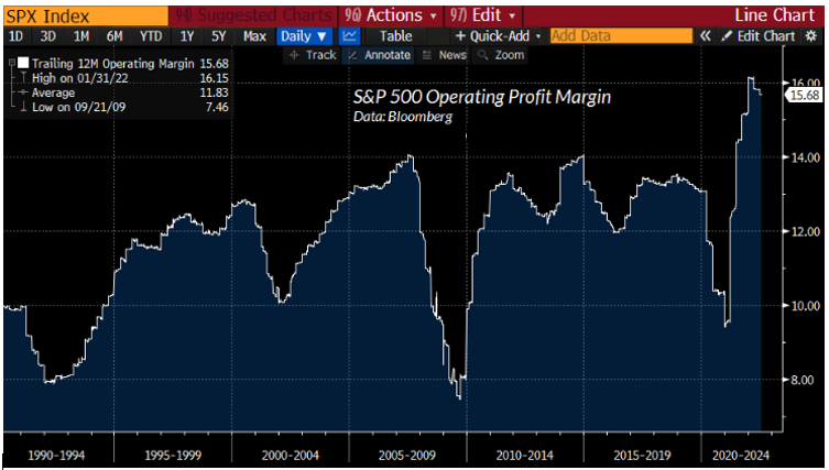
They hit all-time record highs during the pandemic, because when lockdowns were enforced, many firms could sell last year's inventory while cutting ongoing production and costs. From then on, the limitations on supply coupled with still strong demand bestowed firms tremendous pricing power. Both actions boosted profitability of the firms able to survive.
With those effects set to wane, even merely reverting to the highest profit margins seen in history would send the S&P down significantly from here. Reversion to the mean, no less a full-blown recession, would crush it.
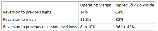
Based on the information provided in the first section, it's up to you to decide which scenario you think is most likely. A cursory look across America will tell you that effectively every company's top line is being eroded by slowing spending while their bottom line is being eaten away by higher input costs, higher labor costs, and higher interest expenses. With that in mind, my best guess is that the reversion won't stop at "previous highs."
A mild recession would likely imply margins compressing to (very roughly) ~12% while a moderate one would send it likely to ~10% or beyond. Getting much more specific than that would require the impossible task of forecasting the exact GDP growth rate, inflation rate, FFR, HY spreads, aggregate operating margin, default rates, investor psychology, etc. years into the future.
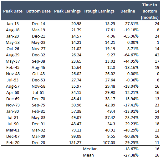
Another way to estimate what would happen to corporate profitability if a recession does hit is by, well, looking at what happened in the past. The table below shows peak to trough EPS for the S&P 500 during recessions going back to 1913. Note that these are all in nominal figures.
Though not pertinent to investment time frames of 1-2 years, a more speculative question worthy of investigation is whether the mean of the last twenty years seen in Chart 38 is a reliable floor to fall back on. 100 years of corporate history as seen in Chart 37 would suggest otherwise.
The primary drivers of the skyrocketing profitability over the last twenty years are the expanded share of the high-margin tech sector, firms like Coca-Cola expatriating their low-margin manufacturing processes abroad while retaining only their margin-rich brand imagine, heightened monopolistic corporate power, cheap debt, and the one-time onboarding of the Chinese labor force. The first two factors aren't going anywhere – America will continue to excel in tech and branding. On the other hand, the last one can safely be ruled out from happening again. Though there may always be relatively cheap labor abroad to exploit, it's unlikely there will be another nation with a tradition of excellence and 1.3 billion hard-working individuals hungry to churn out iPhones until they have they know-how to build their own version.
At the same time the Chinese population grows old and retires, our own baby boomers will do the same in the coming 5-10 years. That will wind down the two greatest demographic booms ever from the two largest economies. I suspect that hole in the labor supply will cause the incremental worker to become more expensive.
The other two factors are more tricky. Debt likely won't be handed out quite as carelessly moving forward but there's a structural ceiling to how expensive it can get: interest rates similar to those of the 80s/90s would bankrupt the U.S. government and therefore will not be permitted by the Fed to happen. So, I'd bet interest rates for companies will be slightly more elevated for companies going forward given their debt loads seen in Chart 25, the inflationary pressures, and the economic uncertainty. But, they can't go all that much higher.
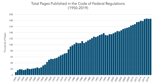
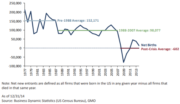
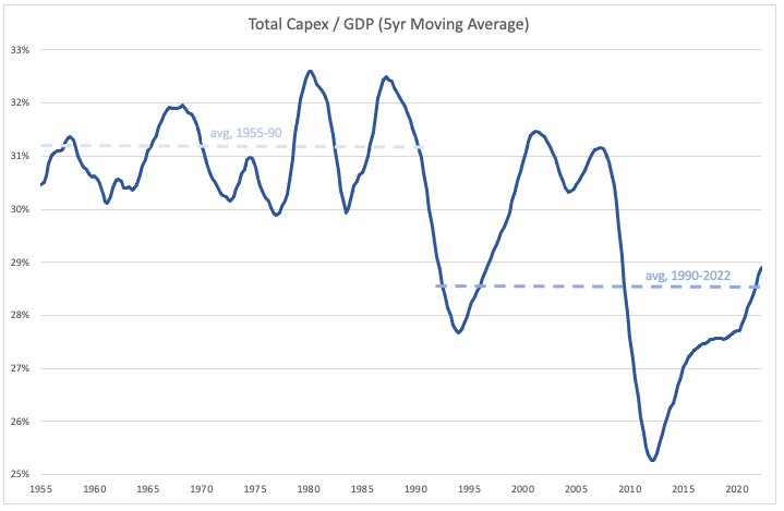
Secondly, GMO's Jeremy Grantham published a terrific summary of the forces supporting the steadily increasing corporate power over the last four decades. He references diminished capital spending, the proliferation of regulations (which benefits large corporations that can spread out that cost over a bigger revenue base), the Citizens United decision, and lower anti-trust action. He argues that the latter three factors have weakened the competitive forces of American business, thus enabling more monopolistic behavior from incumbents. In a properly functioning capitalist economy, excessive margins entice new entrants and capital spending to increase capacity enough to meet that heightened demand and compete away those juicy profits. As portrayed below, this dynamic stalled starting in the 1980s. Recent studies have affirmed that American industry has become systematically more monopolistic over that period.
While I'll hold my breath for Americans to stop suing themselves and for the Supreme Court to reverse the precedent it created, the combination of growing popular hostility towards to corporate profitability at all costs discussed in my last piece, the inertia of Big Tech antitrust lawsuits, and the labor supply dynamic mentioned above gives me the inkling that the pendulum has peaked.
That's not to say I think it's headed back towards the 80s/90s, given the structural forces containing interest rates. It's also not to say that it's an actionable investment insight, given it's highly speculative in nature. The purpose of this discussion is to point out that the image of 'normal' corporate profitability we've been anchored to over the last twenty years is wildly abnormal by historical standards and to catalog some reasons for why this trend took hold. Whether it reverses significantly or not, investors must be conscious of the assumptions underpinning their underwriting and track them accordingly.
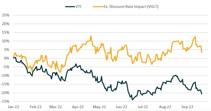
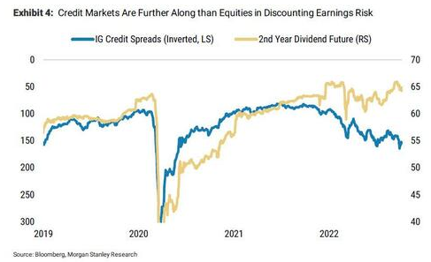
To be clear, not one piece of the above is currently priced into markets. Despite all the huffing and puffing from pundits about a coming recession, the 23% YTD decline in the S&P so far is solely attributable to rising interest rates elevating discount rates as seen in Chart 44. The market is flat when you adjust for that. One shouldn't rely on a single data point to try to estimate what's priced into markets. To triangulate that perspective, one can look at Chart 45 depicting the market's pricing for future dividend payments and consensus EPS estimates. The street's consensus estimate for EPS growth is 10% this year, 13% in 2023, 5% in 2024, and 8% in 2025.
The good news about all this is you don't have to predict the exact level of corporate profitability, GDP growth, interest rates, etc. two years or twenty years in the future. A far easier yet more important investment question has a simple yes or no answer: do you want exposure to whatever unfolds? Thankfully, that requires only a relatively straightforward checklist for underwriting the markets at large:
-
Fundamentals of the economy: in a vacuum, what's the health of the economy? I don't feel good about that, but it's not written in stone. Let's say there's an 80% probability of recession in the forward 12 months.
-
Credit risk: how much mischief would there be if the tide went out and revenues stopped coming in? More unclear than 1) since decades of easy money allowed an extreme number of unprofitable companies to stumble along. How emphatically that facet shuts off will play a disproportionate role in default rates. Either way, at least we're not on Titanic heading for 2008.
-
Valuation risk: how much are you paying for that exposure? Unless 100 years of valuation data proves to be an entirely useless guide for the future, this one's easy. Only twice has it been as expensive as today: 2001 and 1929.
-
Supply-side risk: how much of that pricing is thanks to cyclically elevated profitability? Also at unprecedented highs. And, with the market pricing in continue earnings growth, the reversal that's most plausible to me would be a rude awakening for Mr. Market.
-
Reflexivity risk: if the stock market were to reverse, how overextended are investors' psychologies and portfolios? Some of the irrational exuberance has certainly already been weeded out. Much of the meme stock mania has fizzled out, you don't see jpegs of rocks selling for millions of dollars anymore, blank check companies aren't being raised simply for the sake of signing a check, and the wind has been taken out of many of the high-flying tech stocks. Additionally, a lot of the activity whereby generalists tiptoed into fields outside their specialty and retail participants day traded for entertainment has unwound. My gut actually tells me that most of the fall in markets so far has primarily been the wiping out of the most extreme and exaggerated forms of speculation mentioned above.
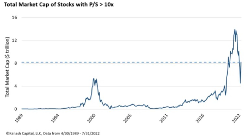
On the other hand, you still have countless examples of unjustifiable valuations. For instance, there are still 29 companies with market caps over $10B with EBITDAs less than -$100M. Similarly, earlier this year, the proportion of the S&P trading at >10x revenues peaked out above the 2001 level. Though this has come down significantly since, you still see all kinds of companies with no businesses being in the 10x revenue club fetching ungodly valuations. As the Bill Gurley article and the quote below articulate, very few companies in history can justify trading at 10x revenue. The poster child of overvaluation is Tesla, a car manufacturer with 20% margins, trading at 13x revenue, 100x P/E and at $1M per car sold in 2021. Compare that to Toyota which trades at 1x revenue, 11x P/E and $37k per car. With a market cap close to $1 trillion, Tesla is the 6th largest company in the world. Where there are pockets of air, there's room to fall.
CEO of Sun Microsystems on his company trading at 10x revenues: "At 10 times revenues, to give you a 10-year payback, I have to pay you 100% of revenues for 10 straight years in dividends. That assumes I can get that by my shareholders. That assumes I have zero cost of goods sold, which is very hard for a computer company. That assumes zero expenses, which is really hard with 39,000 employees. That assumes I pay no taxes which is very hard. And that assumes you pay no taxes on your dividends which is kind of illegal. And that assumes with zero R&D for the next 10 years, I can maintain the current revenue run rate."
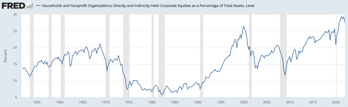
As for whether portfolios are overexposed to equities, the charts below seek to address that. Despite purportedly bearish sentiment, professional asset allocators and households alike are still heavily exposed to equities. In fact, households have never been this exposed to equities.
But, I don't know, maybe 30% isn't a deadly number?
Either way, the narrative that speculation and greed have been squashed does not reflect reality. Reflexivity risk is still high.
- Policy risk: what's the probability that fiscal and monetary policy trigger a reversal? As discussed above, I believe the market still under-appreciates the severity of monetary policy necessary to quell inflation, whether it be in one go or multiple. On the other hand, fiscal policy is a cat in a hat. The government just designated hundreds of billions to write-off student loans at the exact time that I would've figured spending money we don't have would be taboo. Maybe there are more cats in that hat, but that's an unknown.
Personally, I'm not buying what Mr. Market is selling.
But... what if the money printer goes burrr? Would I buy then?
Well, that depends. Despite popular memes, the money printer doesn't directly impact the markets or the economy. As articulated here and here, QE merely swaps bank reserves for Treasuries and can only attempt to sway the portfolio allocations of the commercial banks forced to accept the reserves. If these banks are in a gambling mood and view default-free, low-interest liquidity as inferior to alternatives, they may seek to rebalance their portfolios towards higher yielding stuff like MBS and even IG corporate bonds. All else equal, this process suppresses the volatility and yields of the safest assets. That willingness to move out the risk curve may eventually trickle through to equity investors.
However, the decisions of safe and risky asset managers alike are far from a given. They hinge on the general investor psychology of the time. If people are in risk-off mode and are running towards towards safe assets, creating more of those safe assets doesn't do anything to support the prices of risky assets. This can be seen by the orange line in the chart below, which shows stock prices skidding in environments when Mr. Market is feeling nauseous despite the money printer going burr.
So, it all depends on if people suddenly want to gamble again.
On that point, even if Jerome turns on the jets, I don't anticipate the same Americans who are cutting their spending on everything except the essentials and even taking on second jobs & debt to make ends meet will be eager to throw their remaining cash at stonks.
Taken all of the above together, my hunch is that the S&P won't touch it's January 1, 2022 high for a long time. Indeed, my base case is a lost decade.
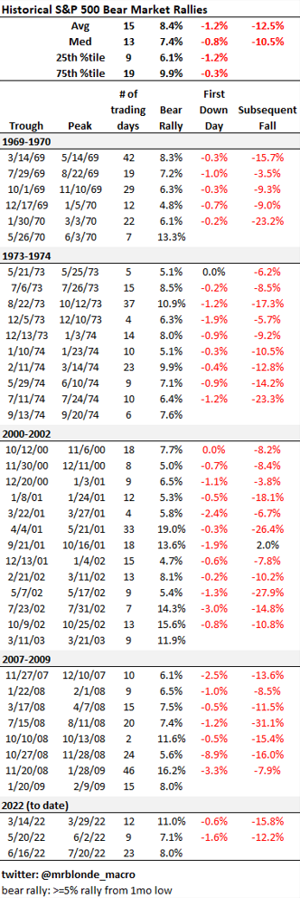
So let's say this is a bear market rally. What would that look like? Over the last 50 years, there have been 5 major and sustained bear markets which saw 40 episodes in total of 5%+ rallies from the 1-month lows. If this turns out to be a bear market rally, it'd be a relatively strong one as the S&P has risen 14% so far since June lows. My hunch is that the economy will most closely resemble 1970 (stagflation), while the stock market will most closely resemble 2001 (a long unwind with many short-clearing rallies).
Appendix
CEO of Sun Microsystems on his company trading at 10x revenues:
At 10 times revenues, to give you a 10-year payback, I have to pay you 100% of revenues for 10 straight years in dividends. That assumes I can get that by my shareholders. That assumes I have zero cost of goods sold, which is very hard for a computer company. That assumes zero expenses, which is really hard with 39,000 employees. That assumes I pay no taxes which is very hard. And that assumes you pay no taxes on your dividends which is kind of illegal. And that assumes with zero R&D for the next 10 years, I can maintain the current revenue run rate.
Full breakdown of sticky vs flexible components of CPI: