Looking in the Rearview

What a wild moment in the cycle we're at.
Going into 2023, most people – including Jay Powell himself – were yet again celebrating the death of inflation, as it stood still for two months consecutively from November to December. However, monstrous January numbers flipped the narrative. The market quickly priced out its expected rate cuts at the end of the year and repriced breakeven inflation far higher. Then, in in the span of 24 hours, it flipped on its head once again. The second and third largest bank failures in US history and the collapse of a GSIB within one week had the market thinking Powell was going to cut rates... tomorrow.
With all the choppiness of the markets, the cross currents and the chaos, what's going on under the hood? What's next?
The health of the economy must be considered before and after SVB. We know a lot about how it looks in the rearview mirror but only so much about what the last two week's events mean for its path moving forward. This article will cover what we know about the economy pre-SVB: why inflation reversed trend, how much the hikes have worked their way through the economy, where the economy is now & where it might be headed. A later one will explore the implications of SVB, the probability of a serious banking crisis, etc.
Specifically, the piece is organized into the following sections:
- The #BigFlip
- The Economy's Resilience
- What History Tells Us
- Impact of the Hikes So Far
- The Current Picture
- How Does It Unwind?
The #BigFlip: What Caused the Reversal in Growth & Inflation
From September to November, Western nations from the US to Japan to the UK saw their sovereign bond markets implode.
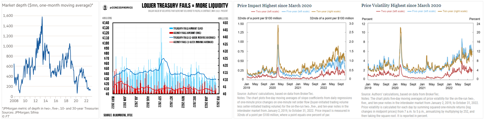
Over the course of 2022, the non-economic buyers of Treasuries increasingly stepped away. When September rolled around, we found out what happens when the non-economic buyers turn into net sellers. Widespread market disfunction ensued as USTs offered economic buyers deeply negative real rates. Trade fails skyrocketed, market depth shrunk to levels seen only during the GFC & COVID, and the price impact & volatility of that illiquidity rose steadily for months.
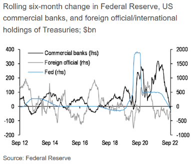
So what happened? The Fed began sterilizing the effects of the QT program. Money market liquidity, bank reserves, and UST illiquidity all bottomed in September. After all, when push comes to shove, the Fed's true objective is to maintain the stability and liquidity of the Treasury market.
The situation, of course, was even more funky in Japan. On several occasions throughout the fall, full days went by with zero trading of JGBs, even on days when auctions were being held... and that's on an $11T market. The record was set at five consecutive days without a single dollar traded. This ghost town in trading was made possible by the combination of the BoJ's promise to buy an infinite amount of JGBs to maintain yield curve control and the fact that it already owned over 50% of all issuance and nearly 90% of the benchmark 10-year bond. In the same fashion as the UST market, the illiquidity caused bid-ask spreads to blow out, volume of orders at best-ask price to plummet, and price impacts to jolt up (link). The charts below show aggregated measures of this mayhem.
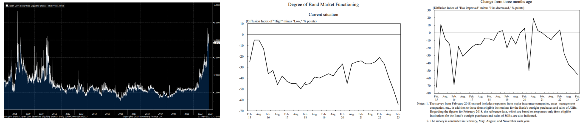
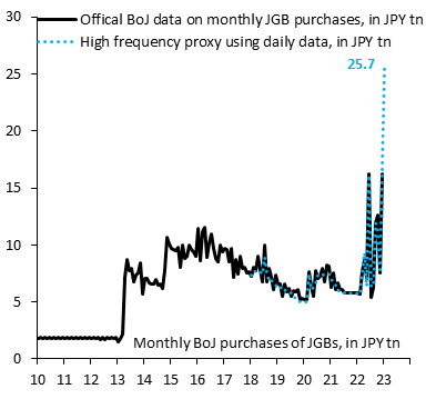
The BoJ's response was far less subtle. It simply bought bonds until the market turmoil subsided:
The Bank of England had a similar response to the market repricing their debt following Liz Truss' announcement that she planned to cut taxes for the rich and increase spending in the face of once-a-generation inflation. The market not-so-respectfully disagreed, puking out both their debt and currency simultaneously which typically only happens in emerging market debt crises. This led to her removal a month and a half after being sworn in – short enough to be outlasted by a head of lettuce. The suddenness and magnitude of the rate move threatened to bankrupt the UK pension system, a situation the BoE admitted posed "material risk to UK financial stability." The BoE stepped in to buy bonds on "whatever scale is necessary." End scene.
China also injected massive amounts of liquidity, only a few months after and for different reasons. The government was dealing with widespread civil unrest related to their zero-COVID policy whilst managing one of the largest housing busts in financial history. Though I will eventually publish a more extensive analysis of China's economic status as a whole, I'll provide a brief summary of the housing situation here because most directly relevant to the topic at hand.
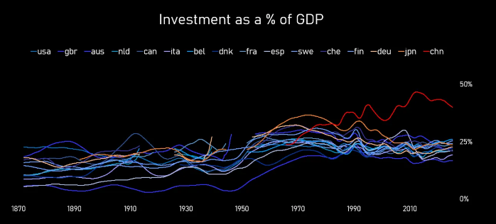
A key starting point is that China's economic growth rate is a pre-determined input decided by politicians at the beginning of the year, not an end-of-year measurement of output like in every other country. If productive, demand-driven growth cannot fulfill that quota, the local governments will build more buildings until the target is reached. That's resulted in China's "investment" rate being higher than any country in history for the last 30 years, accounting for 30-50% of GDP and peaking at 1.5x Japan's max in 1970. Similar to Japan, much of that went into deeply wasteful projects, most wasteful of all was real estate. PIIE estimates that the property sector accounts for 25-30% of GDP.
Just as local government officials are incentivized to build housing and other structures to meet growth shortfalls, Chinese citizens are guided towards storing their wealth in real estate due to China's underdeveloped and opaque financial markets, strict capital controls on investments in foreign assets, and financial oppression. An example of the former trait is that its GDP grew 13.6x since entering the WTO in 2001 vs its stock market's growth of 2x, the differential being transferred from shareholders to... who knows. Another example is that during the GFC, the stock market collapsed by 2/3rds while the housing market in tier one cities fell just 10% before more than recouping losses and housing prices in the rest of the country continued to rise. Lastly, financial oppression consists of having their banks pay a deposit rate of roughly 0% – way below nominal growth of 8%+. This has resulted in real estate being the dominant personal investment option for individuals' savings. In fact, 60% to 70% of households' wealth is tied up in real estate (disproportionately so for the lower classes) and over 20% of households own two or more homes (compared to 3%-13% in OECD countries whose citizens are multiple times wealthier).
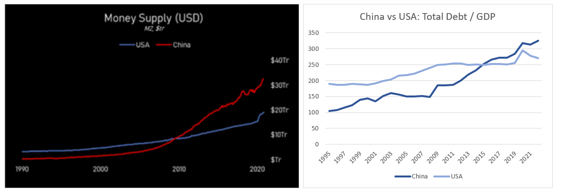
Speculation reached a new level this decade as money and credit flooded the economy to a greater extent than ever before. The relentless rise in money, credit, and prices triggered the familiar Minsky model, where abnormally long periods of growth distorts the economics incentives of market participants such that increasingly speculative activity is rewarded most. Indeed, the very stability of the good economic times sows the seeds for systemic instability.
In this model, the growth is at first fueled by genuine economic activity. In this case, it was the largest urbanization in world history, where the percent of the population living in cities increased from 13% in 1954 to 60% in 2020, increasing the urban population by 700 million people. Housing that many people means that the real estate developers and banks who implicitly or explicitly bet on these good times continuing by building beyond immediate demand, leveraging their balance sheet aggressively, or otherwise embedding rosy assumptions about prices and demand into their operations dramatically outperform more conservative actors – until the music stops.
Over the last decade, some unusually suspect tactics became commonplace. Developers would sell homes before the project had even been started and collect the payment for the house upfront. They would then use that pre-sale money to launch yet another project often before the original project had even broken ground, using the original clients' money as a non-bank funding source. This strategy, needless to say, requires continuously rising prices and demand to not end in financial distress – the stage that Minsky calls "Ponzi finance." By 2021, the numbers became staggering: 90% of all housing sales were presale, developers would start 2.5x as many projects each year as they'd complete, the value of mortgages attached to unfinished homes alone was estimated to be 1.4% of GDP and set to multiply 3-4x without policy action, and the IMF estimated that Chinese real estate developers had liabilities at risk of default worth more than 12% of GDP.
In 2020, the CCP's introduction of the Three Red Lines policy caused the record player to scratch, the music to stop, and the party to end. Housing sales plummeted 49% and would've kept falling if the government hadn't stepped in.
A boom that led to a bubble led to bankruptcies that led to bank failures and bailouts once again led to the government printing money:
Anywho, the combination of Japan, the UK, and China printing trillions while the US effectively halted their QT program and before the EU had started theirs resulted in global liquidity conditions skyrocketing in late 2022 and financial conditions easing dramatically.
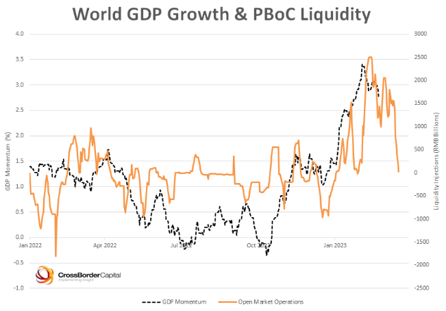
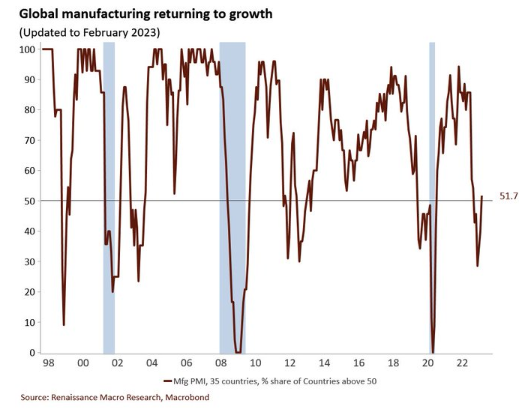
The liquidity injections helped resuscitate economic growth as the chart showing Chinese open market operations and global GDP momentum indicates. A majority of countries' manufacturing output are now expanding, up from 30% when liquidity bottomed. A warm winter in Europe saved the EU economies from Armageddon and China's dramatic return from the zero-COVID lockdowns led them to post fantastic manufacturing numbers (1, 2). Meanwhile, the US economy keeps chugging along. Anyone calling for an immediate recession had to cover their tracks.
Simultaneously, the supply chain bottlenecks that accounted for roughly a quarter of headline inflation returned to normal, the labor markets began to ease without a significant uptick in unemployment, and commodity prices fell. On the last point, a potentially large driver of oil prices falling, aside from an exceptionally warm winter, was Biden's abuse of the Strategic Petroleum Reserve. In the last 18 months, we've cut our national emergency stock of oil in half. To give context for that move, the SPR emergency release had only been called upon three times in its 40-year history: during the Gulf War, Hurricane Katrina, and 2011. Those three events called for a combined release of 60M barrels. So far, Biden has released 300M – as if his reelection depends on it.
All of this led to a temporary period of immaculate disinflation. Global growth rebounded while inflation flatlined. Powell claimed victory and the markets rejoiced.
Then, hot January CPI & jobs prints changed it all. The transitory inflation narrative was itself transitory once again, and we were back to higher for longer. The CPI figured bounced upwards almost entirely because energy prices stopped plummeting. Meanwhile, note that the January jobs number should be viewed with skepticism, as the SF Fed estimates that the weather-adjusted figure would likely be under 400k and the true figure could be as low as 300k if you take into account the survey's sampling error. There is also evidence that survey data across the board has deteriorated in the last couple years due to a decline in participant response rate.
No matter how you adjust the January numbers, they were hot and underscore the fact that core inflationary pressures remain, as will be discussed later. Just as one shouldn't have gotten too smitten by a couple prints suggesting the death of inflation, one shouldn't get too flustered by an aberration the other way.
The strength of the US economy in spite of a historically rapid rise in rates begs a few questions: why has it been so resilient, how much have the rate hikes slowed it down, and what is likely to come in the future?
The Economy's Resilience
Addressing the resilience of the US economy thus far to the 450bps of hikes requires a survey of both the vulnerability of the 2022 US economy to rate hikes before they began and what the academic literature has to say about the expected effect of the hikes once they began.
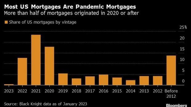
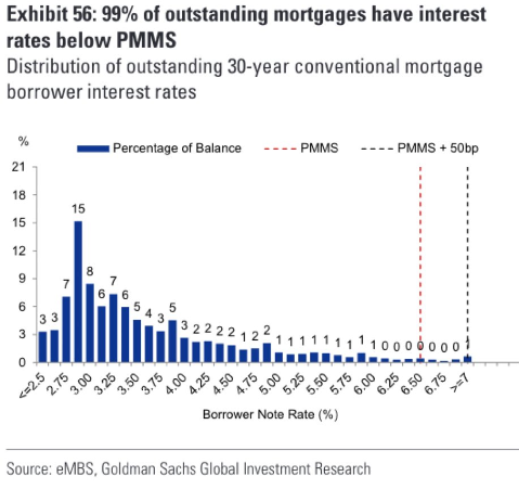
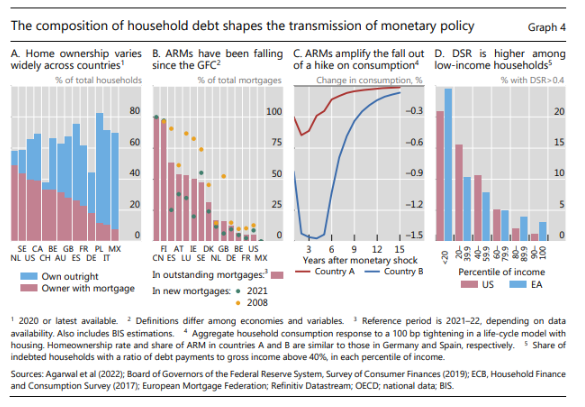
The US's insensitivity to rate hikes so far can be attributed to the private sector locking in low rates over the last couple years, household's low levels of debt, and the private sector's limited exposure to adjustable rate debt (ARM) and short-term debt. First, both corporates and households used the widespread credit availability of 2020 & 2021 to lock in exceptionally low rates:
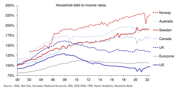
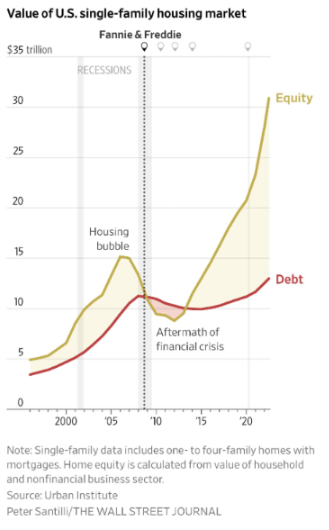
Second, US households have relatively conservative financing positions and are less levered to the value of their homes than in the run-ups to past financial crises:

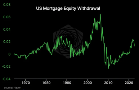
Not only are households fairly unlevered to the value of their homes, but they also have an equity value cushion like never before so it'll take a whole lotta impairment before they're underwater:
Third, the private sector's terms of borrowing are very favorable compared to other countries as well as to past decades. Note how ARMs amplify the effect that interest rate hikes have on consumption as seen in chart C of the second graph.
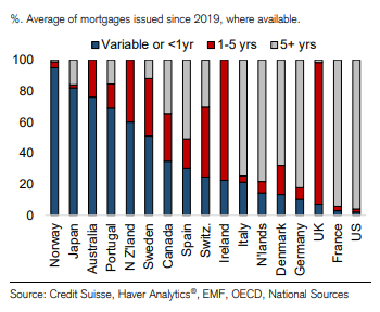
The large percentage of the private sector that locked in long-term, fixed-rate loans at low interest rates means will be be largely shielded from the hikes. Add on top of that the relatively low household debt and you've got a private sector that's unusually insensitive to short-term fluctuations in interest rates.
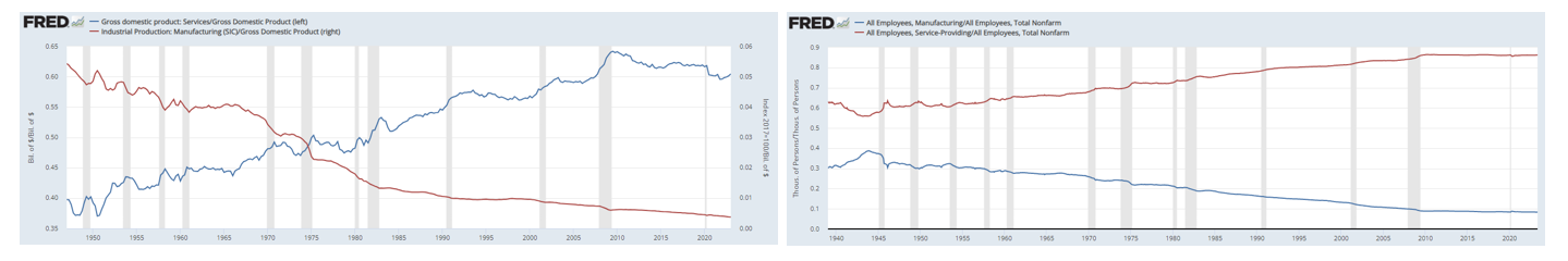
In addition to the population's financial health specific to this cycle, the economy's limited responsiveness to rate hikes should also be understood in the context of the four-decade-long decline in the economy's sensitivity to interest rates, driven in large part by a re-structuring of both output and employment towards industries less sensitive to cycles:
Now that we've covered the vulnerability of the US economy to a rate shock, let's see what the academic literature says we should expect from such a shock.
What History Tells Us
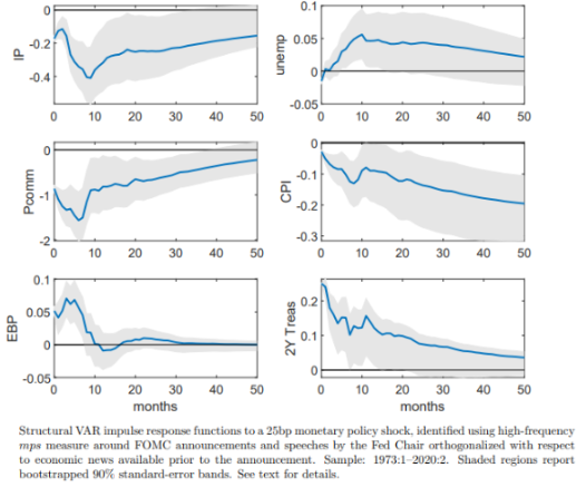
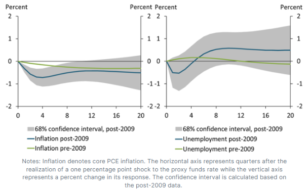
Studies show that the "long and variable lags" slogan often now used as a euphemism for admitting we don't really know what's going on isn't supported by empirical reality. The phrase was originally coined by Milton Friedman who used it to describe the cumulative impact of changes in money supply on level of GDP, not the maximal effect of interest rate shocks on the rate of change of GDP growth. Recent research indicates that latter occurs over the timespan of several quarters, not years. Multiple studies, the results of which are shown below, suggest that the maximum rate of change impact occurs 2-3 quarters after the shock.
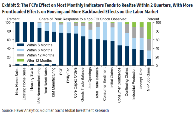
As the chart above shows, housing tends to get wacked by hikes before others segment of the economy. Goldman's far from the only group to identify the housing market's sensitivity to rates and to the economic cycle. Dozens of academic studies have consistently linked leading indicators such as real home prices, home sales, starts, permits, and mortgage applications to future residential investment and residential investment to future GDP growth. This study reviews some of the literature on the subject, so I won't catalogue them here. While some have postulated that the correlation between the two cycles have weakened over the last two decades (1, 2), the balance of the evidence suggests that housing is fundamentally intertwined with the broader business cycle and quite reliably leads it. Indeed, the provocatively titled study "The Housing Cycle is the Business Cycle" was probably right.
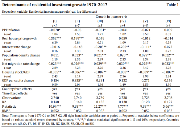
The best study I could find was a 2018 one by BIS. Its strengths lie in its recency and the fact that it studied 15 advanced nations across the last 50 years, yielding it 2,740 quarterly observations and 99 recessions to work with. It found that residential investment is on average 5x more volatile than GDP and that it leads GDP by several quarters, both results are consistent with other studies' findings. It also identified several predictors of residential investment. Note that it didn't investigate the leading indicators mentioned above, but those have been identified by other studies. For instance, one that uses data from 34 countries found that building permits lead GDP in 52% of countries, starts lead in 75%, and prices lead in about 60%.
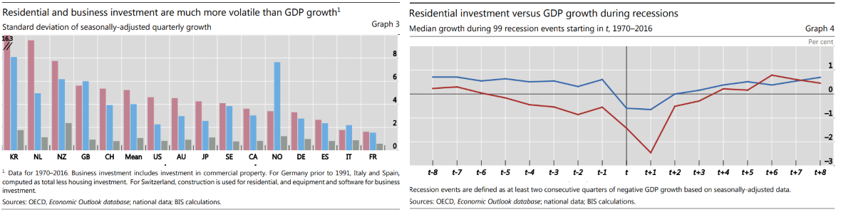
Additionally, one should keep an eye on construction employment, because it typically peaks 4-6 months before the peak in total employment and because it accounts for an average of 15% of the jobs lost during recessions despite only accounting for 5% of total employment.
Okay, how does theory relate to practice?
Impact of the Hikes So Far
As expected following a massive rate hike, the leading indicators of housing activity have collapsed.
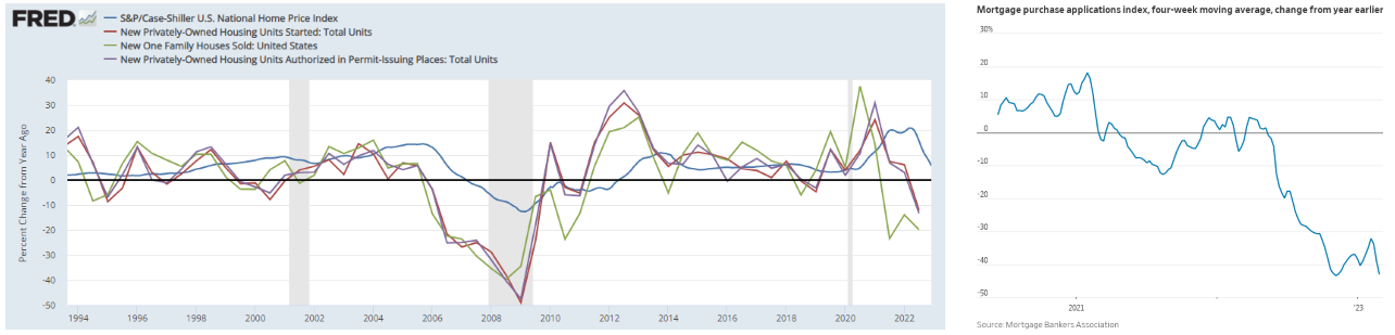
Though, to a certain extent the decline in sales represents a return to normalcy as 15 million homes were sold from 2020-2022 above what the 2014-2019 trend would predict. That's 15 million homes that don't need to be sold in the coming years. However, the fact remains that housing affordability is currently at levels that routinely induce a market correction so further price declines should be expected.
The correction in the leading indicators above has so far yet to flow through to broader construction activity due to the inherent lead-lag dynamic and due to two reasons specific to this cycle. Historically, it typically takes about 12 months before a weak housing market or about 6-9 months before weak construction spend leads to falling construction employment. Moreover, the last four times there has been as steep a decline in the leading variables as this year's, units under construction followed path 5-6 months later.
This housing cycle has seen longer lags than the historical precedents above, though there's some indication they're starting to budge. Units under construction are almost certainly reaching their ceiling right now, which would put the lag at 10 months or roughly double the past examples. Moreover, construction job openings fell sharply in the latest employment data and construction layoffs inched up.
Why has the cycle taken longer? There's a record backlog of houses under construction as supply chain and labor shortage issues made meeting the spike in demand more delayed than it'd otherwise be. Everyone employed on those projects keeps getting paychecks at least until they're completed. Second, it's possible that developers are hoarding workers in anticipation of an infrastructure boom, fueled by the recently passed bills. The $1.2T infrastructure bill will be allocated over 8 years and the $500B IRA bill over 10 years, for an combined yearly average spend of ~$200B, some percentage of which would go towards construction and all of which would enjoy some degree of multiplier. One former Treasury advisor estimated that construction would constitute roughly $40B of the total average annual spend, starting its ramp up this year. This would offset some of the residential decline but not all of it if the housing market doesn't recover on its own.
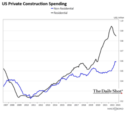
In fact, non-residential construction spend has already ticked up, wholly offsetting the decline in residential spend. Maybe that's a catch up to trend that will promptly peter off or maybe that's the start of a new secular, Congressionally-fueled trend capable of sustaining construction activity through what would otherwise be a recession.
Another sector with high beta to rates – manufacturing – has also dwelled in contractionary levels for the last four months. Leading manufacturing indicators like new orders and new export orders remain soft with customer hesitancy, destocking and the impact of higher interest rates and inflation being the primary explanations customers give.
The relative weakness of the housing and manufacturing sectors can be corroborated by the Visa spending report showing that spending in the areas of the country most exposed to those sectors have been disproportionately hurt.
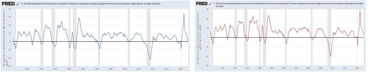
Next, rate-sensitive expenditures aside from housing – like business equipment and durable goods – have also collapsed. EPBResearch collectively calls these types of items the "high powered" segments of the economy, because he believes they drive its cyclicality. I couldn't find many good, recent academic studies that analyze whether they systematically lead the broader economy. However, multiple studies confirm that durable goods and business equipment are both highly correlated with the broader economy and exhibit 2.8x and 3.3x its volatility, respectively. Thus, EPB's claim has support from the fact that these items' volatility and correlation profiles are similar to those of housing, their sensitivity to the economic cycle makes clear intuitive sense, and the eye-ball test gives it a thumbs up with respect to timing:
Other than these understandably rate-sensitive sectors, the real economy hasn't slowed too much. Why is that and where might the economy be going?
Current Picture
As I've said before, the thing people continuously misunderstand about inflation is that its fundamental driver isn't semiconductor shortages or other supply chain issues. Notice that despite those issues returning to pre-COVID levels, inflation, sticky inflation, and wages all remain 2-3x target levels. Though the supply side of things greatly aggravated the problem, inflation's permanence is ultimately explained by the government increasing the spending power of the private sector by more than it has in over 60 years. If you print $5.1 trillion out of nowhere and let it rain down from helicopters to every man, woman, and child, they might just spend it. And, remember that one person's spending is another's income. So, unless you take similarly drastic actions to vacuum that out of the economy, it'll keep circulating for a long time.
Also recall that the Federal Reserve backed that action up with an additional $4.6 trillion in asset purchases to suppress financial asset volatility and yields. The result was a massive increase in wealth across all income groups. As they say, a trillion here, a trillion there and sooner or later, you're dealing with real money.
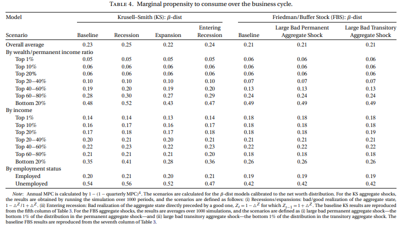
Importantly, the policies initially increased the wealth and the incomes of the lowest income groups the most. These groups have the highest propensity to spend those extra dollars – economists call this their "marginal propensity to consume" (MPC). In fact, recent studies have estimated that the bottom quintile's MPC is 2-4x that of the top quintile (1, 2). And, spend they did.
Strong consumer spending has continued to this day. In Visa's latest quarterly earnings call, the CEO said that spending has been "resilient, stable, and consistent" across countries, product, and consumer segment. Over the last year, it has run 40% above the firm's pre-COVID volume trend.
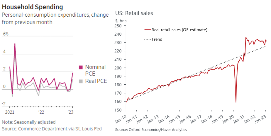
One can see from the charts above and from Visa's Spending Momentum Index that spending cooled off towards the end of 2022, and then proceeded to gap upwards in January. This can be partially explained by a rebound from a cyclically weak December, but likely more so due to manipulation from an unusually strong flu season and to increased social benefits being distributed. Half the states had an annual bump to minimum wage hit in January, though roughly only 1.5% of workers or 2M people are below their state's threshold. The bigger ticket item is Social Security checks being adjusted for inflation by +9% and sent to 70M people. That’s +$140 a month or $1680 a year for 70 million Americans.
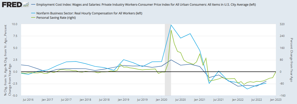
The increased demand over the last several years supported correspondingly tight labor markets, as someone's spending is another's income. All measures of wage inflation remain at or above 5%, all measures of labor market tightness remain secularly tight, workers still think it's easy to find a job, they still have an easy time switching from unemployed or out of the labor force into a job, claims remain dead in the water, and small businesses are still hiring at competitive rates.
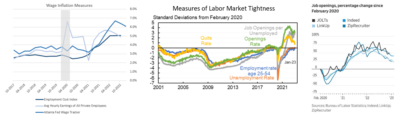
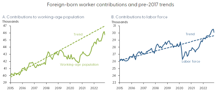
The easing of the labor market can be attributed to participation rates continuing to creep upwards, driven by immigration and pandemic-affected jobs catching up. As seen in the charts below, immigration has surged towards its pre-pandemic levels. The SF Fed estimated this reduced the vacancy-to-unemployment ratio by 6%. Meanwhile, leisure and hospitality, education and healthcare, and government have accounted for roughly 2/3rd of the non-farm payroll gains over the last six months. They still remain well below pre-pandemic trend (e.g. leisure and hospitality may be ~1.5M workers below trend), so they should be able to support >150k gains for some time.
In addition to the gentle disinflationary force of more people wanting to work, there have also been some foreboding signals like WARN notices ticking up, construction joining tech in rounds of layoffs, and small businesses have begun shedding workers (1,2). However, these whispers of things to come could just as easily reverse quickly with the wind.
The analysis above points to the key dynamic to watch: on the one hand, labor market tightness and spending have clearly peaked; on the other, they're coming down from historic highs and some remain multiple standard deviations above the pre-COVID trend. The tug of war between these two sets of facts is essential to tease out.
How Does It Unwind?
The things to watch are the construction market, the labor market, and spending. The leading indicators of the health of the former were spelled out above: key in on units under construction, construction layoffs, hires, residential and nonresidential spend. The labor market as a whole and spending are trickier, because they span the entire economy and are inherently far more circular. The health of employment depends on the health of companies' cash flows and balance sheets which depend on spending which depends on employment.
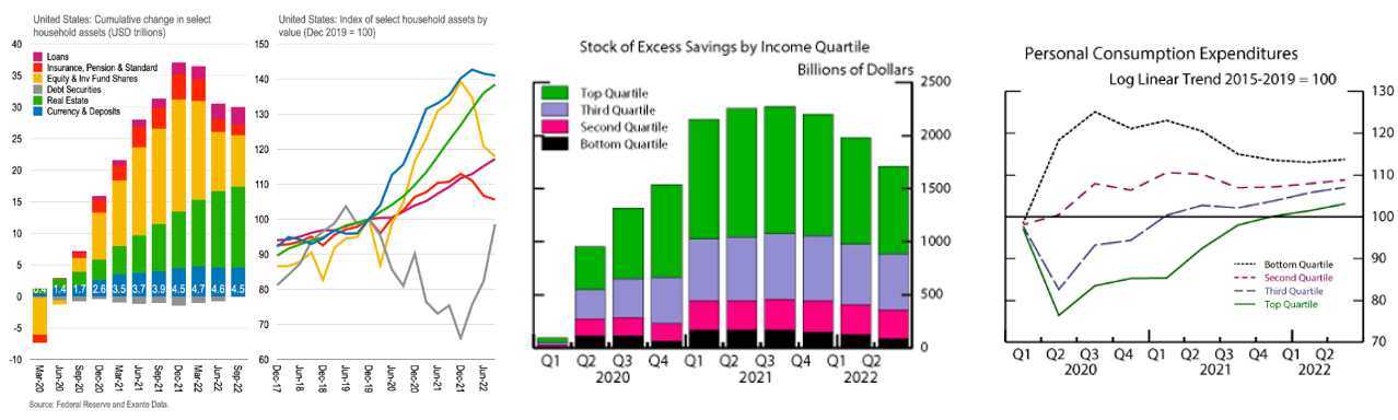
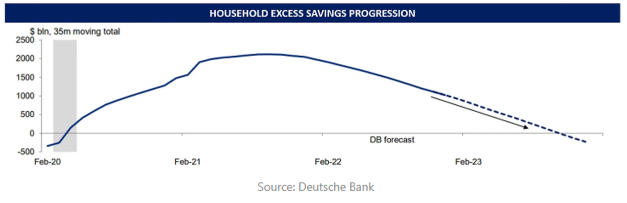
The primary pillar holding up the economy is household's excess savings. It's the key to where this inflationary episode began and where it'll end. Deutsche Bank estimates that it's currently at $1.1T, down from the Fed's estimated $1.7T in Q2'22 and the peak value of ~$2.3T nine months before that. DB extrapolates this spend down rate into the future to guess that the stimulus-induced excess savings will be fully spent by the third or fourth quarter of this year. Note that these are rough estimates reliant on various assumptions, as detailed in the Fed article.
Why are excess savings being run down? The obvious answer is real consumer spending being greater than real incomes. For the last two years, wages didn't keep up with inflation. When you're making less in real terms and want to live the same lifestyle, you've got to spend more than you make and dip into your savings.
The household dissaving is primarily just a transfer to business profits, however. Corporate profit margins reached 70-year highs as they benefited first from their own stimulus packages and then from consumers overspending.
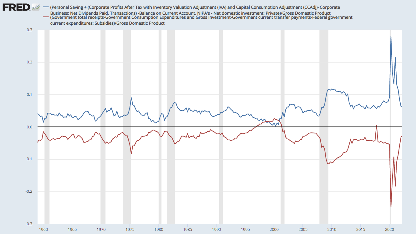
If the spend down in excess savings primarily constitutes a transfer from households to businesses, then why has total money in the private economy shrunk to below its pre-COVID level as seen above? Money leaks out of the imaginary closed economy model where one person's spending is another's income in a few ways. The most obvious drag is Uncle Sam getting his cut of all economic activity. Tax receipts skyrocketed over the last couple years, with the IRS getting an added boost from people reaching higher tax brackets either due to real pay bumps in a hot labor market or purely due to inflation since tax brackets are based on nominal not real earnings. Not coincidentally, the estimated impact of fiscal policy on the economy turned negative the same month that excess savings peaked and has been remained so since, nearly mirroring the path of excess savings. After all, they are the fiscal transfer and were promptly transferred back to the government. Uncle Sam giveth and he taketh away.
The second and third ways have to do with money being transferred from spenders to savers. The latter group store their funds in financial assets, a process that generally siphons spending power out of the real economy, since funneling money into the S&P 500, etc. has a loose relationship at best with real economic activity. Aggregate transfers to savers happens not only when people are increasingly bracing themselves for a rainy day, but also when citizens have different savings rates. As mentioned previously, wealth inequality maps almost directly onto savings rates. The wealthier the person, the more of their income they save.
As time goes on from the moment the stimulus hit, the lowest income quintile with the highest MPCs spends all of their excess savings first, at which point those savings have been transferred to the wealthier 90%. Then, the next quintile exhausts all of theirs, and so on. In this way, the excess savings gradually trickle up the MPC gradient towards the wealthiest people who spend the least out of their earnings. A recent study explores this process.
Finally, both households and businesses used a good portion of their stimulus checks to pay down debt, with estimates varying between 15% and 30%. While only bank debt repayments permanently removes money from the economy, all other principal pay downs transfer money from spenders to savers, almost by definition. Some of this will be relent out into the real economy, but the rest will be saved. Moreover, interest payments will rise for both consumers and businesses that either borrow short-term or are exposed to adjustable rates. While this has yet to play a significant role, it impacts the economy in the same way as debt repayments by transferring money from spenders to savers and will gradually play a larger role as people are forced into new contracts if interest rates remain elevated for a while.
As these processes whittle away at the money circulating in the private economy, an interesting dynamic is now emerging: consumers are nearing both the end of the free cash they got handed and a return to positive real wage growth as inflation subsides. The former unequivocally reduces spending prospects. And, as said above, the lower and middle classes who spend their savings first are the first to feel the pain. Earnings calls give an indication of this. Consumers at places like Nordstrom Rack and Dollar Tree have become increasingly conscious of their spending, while the luxury brands keep chugging along. Similarly, the Uber CEO said that: "The labor environment feels looser for us. 70% of drivers are saying that they're coming onto the platform because of some of the inflationary effects that they're feeling, they need to augment their earnings."
Meanwhile, the latter fact that real wages may soon be positive means that consumers could keep spending without actively dissaving or taking on debt to do so. The flip side of that is it increases the real costs for firms, which may lay people off as they see their bottom line get squeezed. This dynamic is shown below. The end of free money re-instills tension between employers and employees, between spenders and producers. Choices must be made.
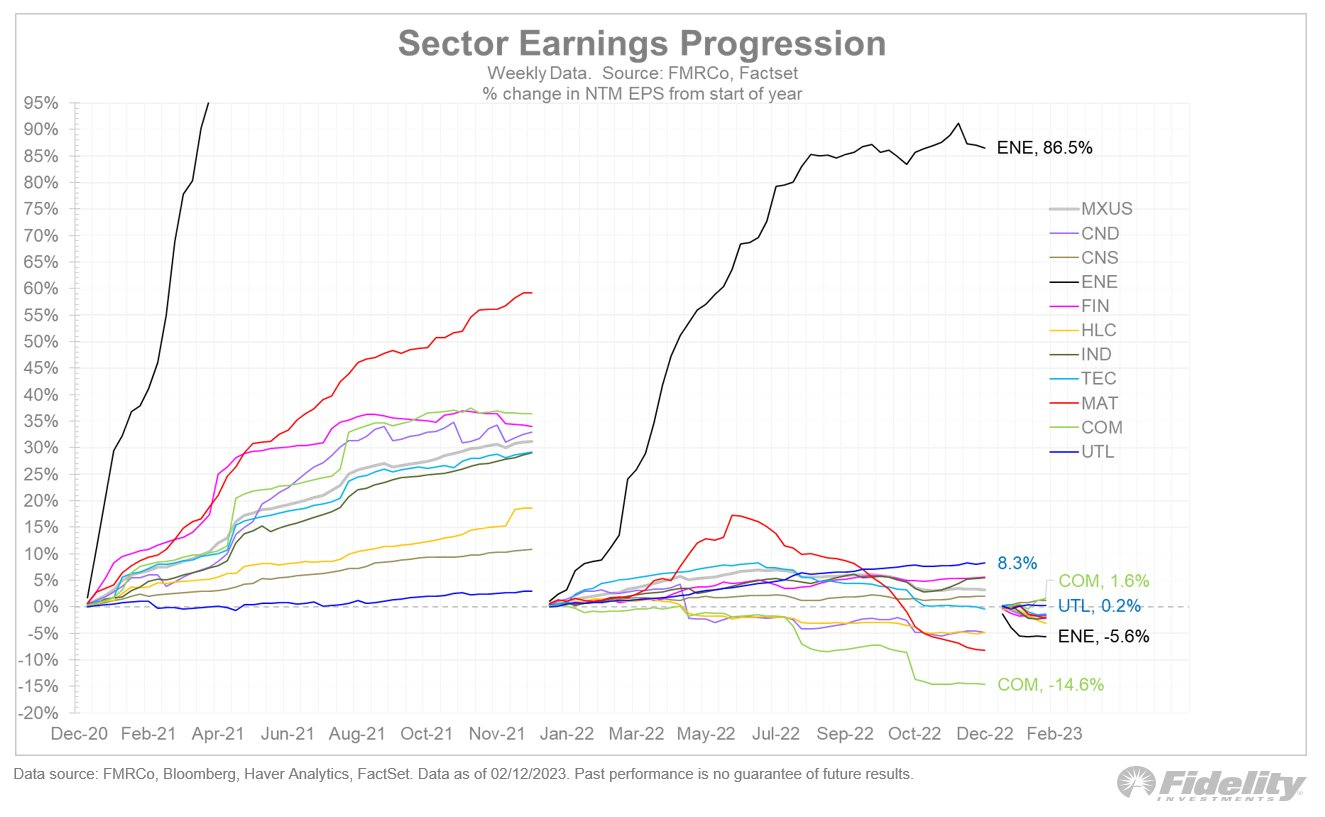
It's been a slow start to the year for all sectors except communications, which is barely positive after a terrible 2022:
It's also possible that reported earnings don't stand up to cash flows:
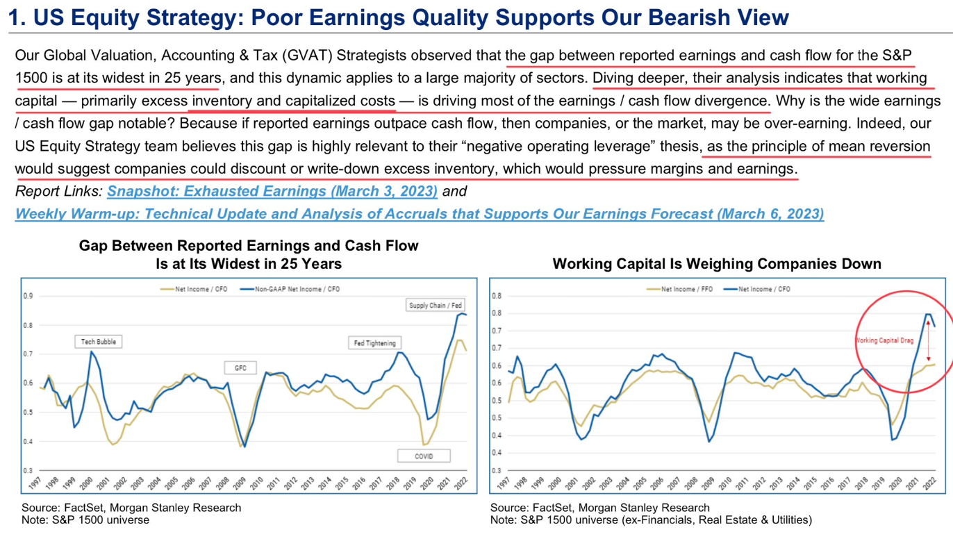
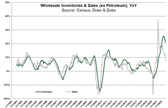
Here's the excess inventory stocks mentioned above:
So, what does all this mean? By and large the economy looks quite healthy when looking purely in the rearview. While there are some signs of slack like excess inventory or labor market easing, these are generally exceptions that prove the rule of a once historically overheated economy trending towards something more normal. However, several things suggest that the economy will keep going past normal – aside from the fact that it rarely swings from one extreme and settles gently in the middle. First, rate-sensitive sectors like construction and durable goods that typically lead the cycle have collapsed. Second, excess savings, the pillar holding up spending, should be depleted some time in the latter half of the year. Third, the effects of higher for longer will gradually erode economic activity.
Before SVB happened, I expected a recession starting in the second half of this year whose severity ranged from mild to so-called garden variety.
A piece coming soon will detail how that's changed.